![]()
Portfolio
Spotlight Center Stage Email Blast
The purpose of this design is to provide an e-mail blast for the fictional Spotlight Center Stage, a community theater group, that promotes ticket packages and donations for its youth programs and workshops. The audience for the artifact is current patrons, volunteers, families, and local organizations that can provide sponsorships. I needed to stylize the copy provided by the client and use imagery that supported that copy, while keeping a clean and sophisticated look to attract organizations and average people alike. Branding included fonts, colors, and the logo.

Holiday Card Animation
This is a holiday card animation for an IT department. It needed to not reference any specific holiday and keep a fun techy vibe. I chose electronic music that felt like it fit with the season and designed the computer and program to emulate an old 1980s Macintosh.

Retouched Family Photo – Before & After
The client needed an old family photograph to be digitally retouched. They provided the scan for the original photo, and I used various techniques in Photoshop to repair it and bring out the shadows more. I have presented both the before and after images.

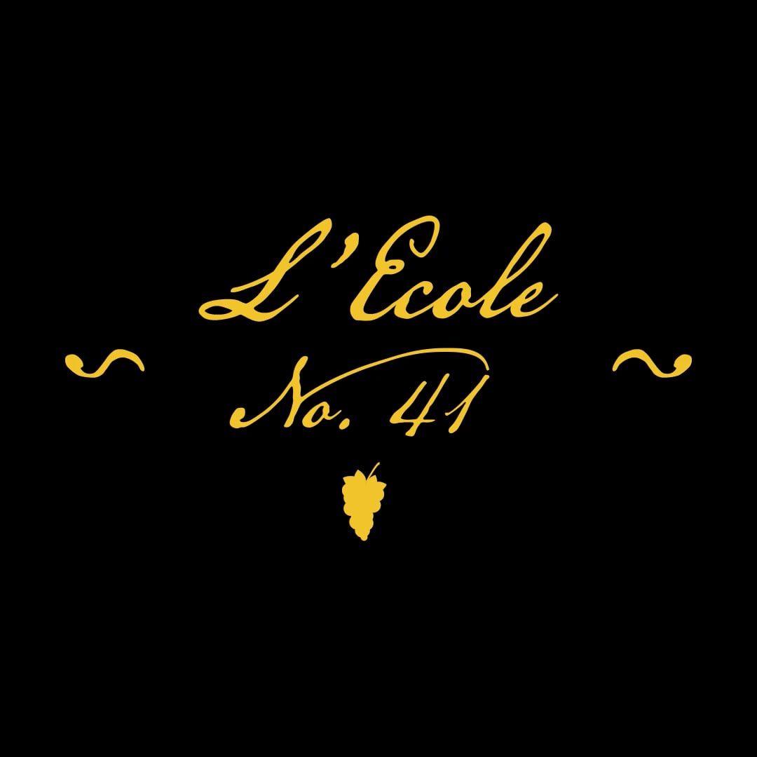
L’Ecole No. 41 Animated Logo
This is a logo redesign concept, done for practice, that has been animated for use in a hypothetical commercial. L’Ecole No. 41 serves an upper middle class audience, so I went with an old world feel with the cursive handwriting, and used gold to show wealth.
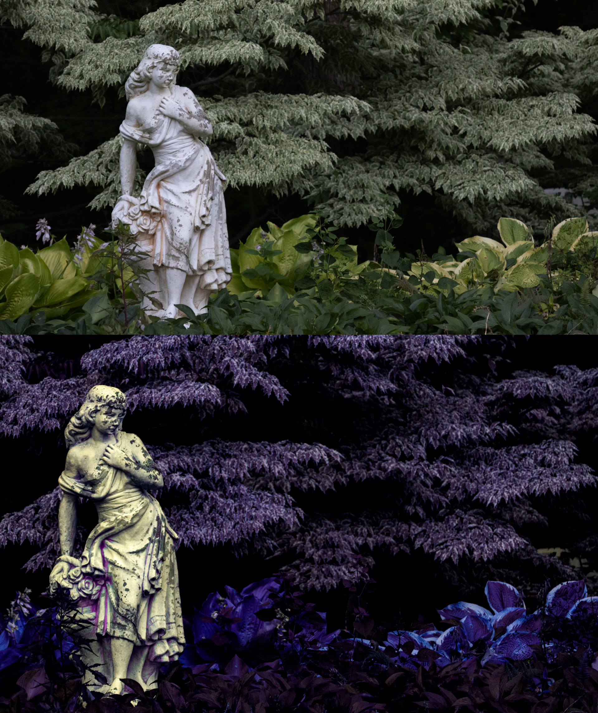
Outdoor Statue – Before & After
This is a photograph I made, shot at park, and given an other worldly feel through color and emphasizing the aging texture of the statue. I have presented both the before and after images.
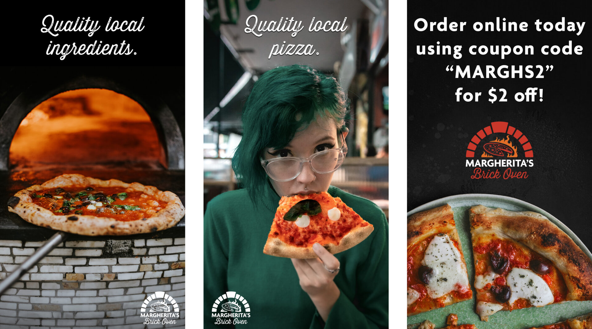
Margherita’s Brick Oven Social Media Carousel Ad
This is a carousel ad for social media for the fictional Margherita’s Brick Oven, a restaurant that serves brick oven pizzas. This was meant to resonate with a younger audience by placing a younger person in the ad eating the pizza. Branding colors, fonts, and logo were used.
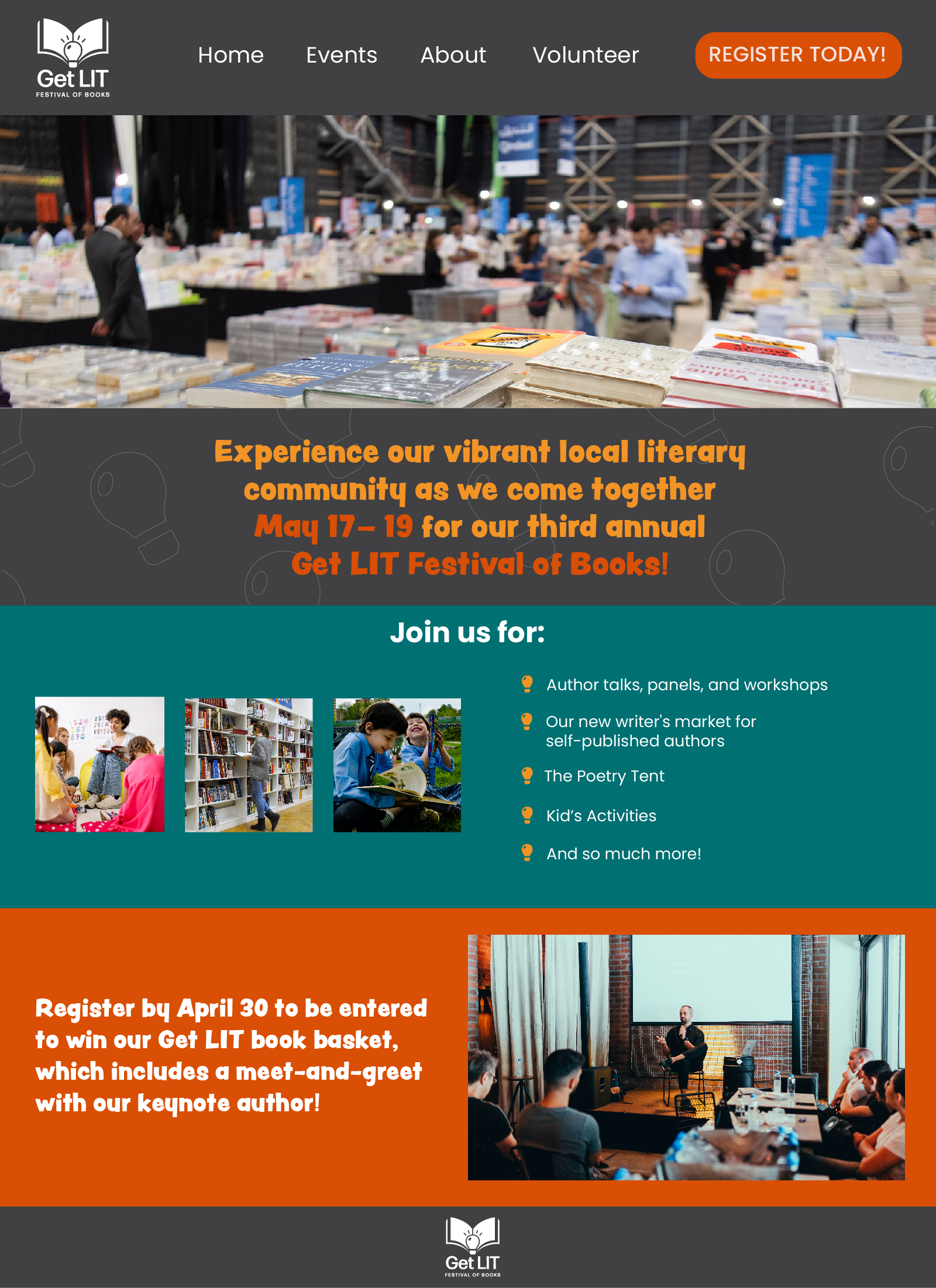
Get Lit Festival of Books LandingPage
This is a landing page for the fictional Get Lit Festival of books. The intent was to create a clean landing page that utilized the brand’s colors, fonts, and logo. The target audience is diverse, so I made sure to include images that reflected different ages and backgrounds.
Fresh Fare Farms Display Ad
This is a display ad for the fictional Fresh Fare Farms, a food subscription service. I used the branding colors, font, and logo provided. The challenge was to get the copy, the logo, and an image into a tiny space AND have it animated, while maintaining readability. Having the call to action button animate in from the right, where everything else was guiding the eye, seemed to solve this problem.

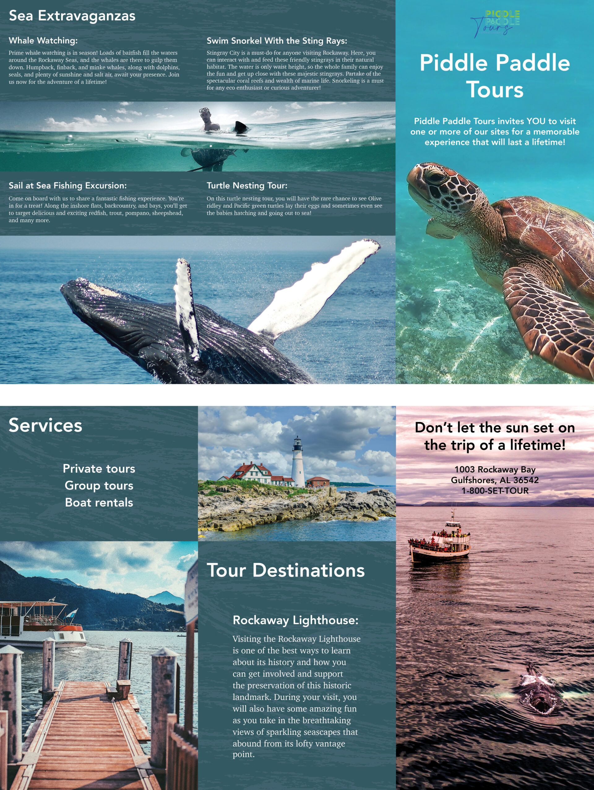
Piddle Paddle Tours Brochure
This is a brochure for the fictional Piddle Paddle Tours, a boat touring and rental service. There was a lot of information for specific areas, and not so much for others, so I used text size and texture to fill in some of the excess white space. This is a z-fold brochure, so no page sizes were adjusted.
RacerX Logo
This is a logo concept for the fictional gaming company, RacerX. Market research was done to determine that millennials, who were the target audience, would prefer colors in the tech industry, which is why I went with yellow and blue for the logo colors. The mark is a modern joystick controller that also resembles a trophy with its shape and color. The font gives motion to the logo, which is appropriate for the company name.